Raster vs Vector: What Every Designer and Musician Needs to Know to Make Your Record Cover Stand Out.
When it comes to designing album covers, posters, or merchandise, choosing the right file format can be the difference between a sharp, professional look and a blurry, pixelated mess. Understanding the differences between raster and vector images can elevate your work, ensuring it looks great in print, online, and everywhere in between.
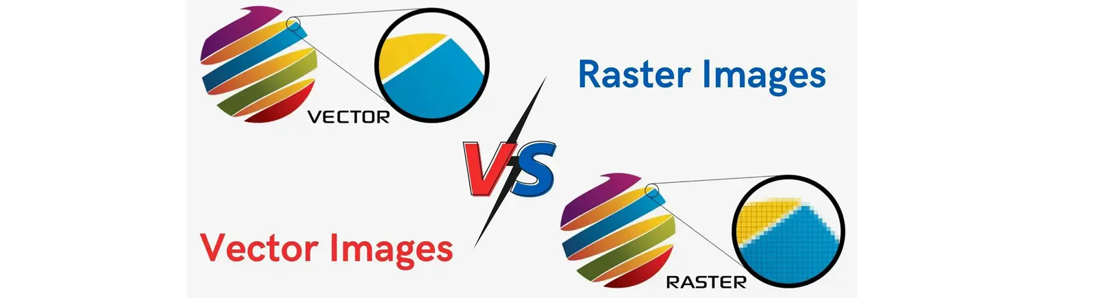
What Are Raster Images?
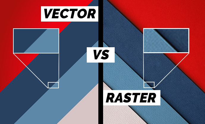
Raster images are made up of pixels—tiny squares of color that come together to form a complete picture. The more pixels in an image, the higher the resolution and quality. However, when you zoom in or enlarge a raster image, those pixels become more apparent, resulting in a loss of clarity. Think of a digital photograph—when you blow it up too much, it starts to look blocky and unprofessional.
Common raster file types include JPEG, PNG, GIF, TIFF, and PSD. These formats are ideal for complex, detailed images like photographs or textures, but they come with larger file sizes that can be difficult to share or store. For album covers that need rich, detailed photography, raster images are the way to go. But be mindful of resolution—stick to at least 300 DPI for print to avoid pixelation.
What Are Vector Images?
Vector images are composed of mathematical paths and curves, not pixels. This means they can be scaled infinitely without losing quality. Imagine a band logo that looks just as crisp on a business card as it does on a billboard. That’s the power of vector graphics.
File types like AI, EPS, SVG, and PDF are common for vectors. These formats are perfect for logos, typography, and geometric designs where precision and scalability are key. If you're designing a logo for a record label or an artist, vector is the way to go. Not only will it look razor-sharp at any size, but the file sizes will also be smaller and easier to manage.
Raster vs Vector: Which Should You Use?
-
Photographs and Detailed Artwork: Raster. They handle complex colors and gradients better.
-
Logos and Text-Based Designs: Vector. They maintain clarity at any size.
-
Web Graphics: Raster (optimized for faster loading).
-
Print Graphics: Both. Use vector for text and logos, raster for images.
The Bottom Line
For designers and musicians creating album covers, posters, or promotional materials, knowing when to use raster and when to use vector can make all the difference. Raster images bring rich detail and color complexity, but at the cost of larger file sizes and limited scalability. Vectors, on the other hand, offer crisp, scalable designs perfect for branding and typography.
So, before you hit “export,” ask yourself: Is this design more about rich photographic detail, or does it need to maintain perfect clarity at any size? The answer will guide you to the right format, ensuring your work looks as sharp and professional as you envisioned.
Vector vs. Raster FAQs
1. Can I convert a raster image to a vector?
Yes, you can convert raster images to vector using design software like Adobe Illustrator. However, the quality and accuracy of the conversion will depend on the complexity of the original image. Logos and simple graphics work best for conversion, while detailed photographs can lose clarity or appear overly simplified.
2. Which format is best for printing an album cover?
For printing an album cover, a combination of raster and vector is ideal. Use vector for logos, text, and any scalable graphics. Use high-resolution raster images (300 DPI or higher) for photographs and complex artwork to ensure clarity and color accuracy.
3. Why do vector files sometimes look different when opened in different programs?
Vector files can appear different due to compatibility issues between software programs. For consistent results, use the same program for creating, editing, and exporting the vector file, and ensure that fonts are outlined or embedded to prevent unexpected changes in appearance.